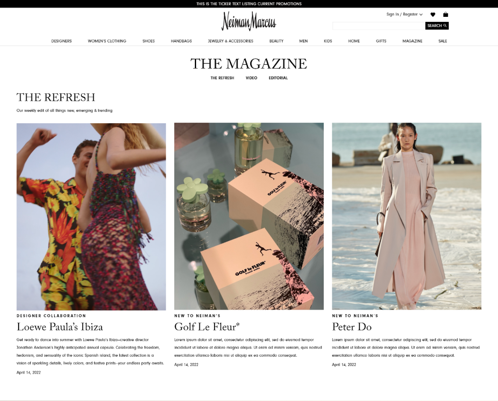
The Refresh
Overview
The Refresh is your one-stop destination for all things new, emerging and trending. It’s where Neiman Marcus spotlights the names making waves in the industry, the pieces approved by influencers around the world, the freshest designer collaborations, plus exclusives you can’t get anywhere else.
Role
Lead UX Designer
Product Strategy, Visual Design, Prototyping, Content Mapping, User Journey, Marketing Strategy
Lead UX Designer
Product Strategy, Visual Design, Prototyping, Content Mapping, User Journey, Marketing Strategy
Problem
Customer frequency to the website was down and our traditional marketing strategies weren’t working to capture the level of growth that was set for coming quarters. The initial idea for the project was to try to cater towards our fastest growing segment which was men’s sneakers. The goal was to grow the men’s sneaker audience and to eventually graduate them from men’s sneakers into other related categories (ie men’s contemporary, grooming and denim).
VisionAfter a failed presentation over this initial brief, we had a cross-functional team workshop to create a new strategy. The new plan was to cater to first our Emerging Customers and secondly our Evangelist Customer. We wanted to create a destination on our website that updated frequently with relevant, trending, emerging and new content that highlighted the interesting brands, collaborations and exclusives that didn't normally get placement due to co-op requirements.
VisionAfter a failed presentation over this initial brief, we had a cross-functional team workshop to create a new strategy. The new plan was to cater to first our Emerging Customers and secondly our Evangelist Customer. We wanted to create a destination on our website that updated frequently with relevant, trending, emerging and new content that highlighted the interesting brands, collaborations and exclusives that didn't normally get placement due to co-op requirements.
Process
With a strategy in place it was then my job to find a home for The Refresh and map out how and what touch points on we could leverage to drive to content. I started off by creating a flow chart of all available placements we had on the site to drive to The Refresh and the path to purchase.
With a strategy in place it was then my job to find a home for The Refresh and map out how and what touch points on we could leverage to drive to content. I started off by creating a flow chart of all available placements we had on the site to drive to The Refresh and the path to purchase.

Once the flow chart was finished it was onto the API flow chart for how we would be able to automate the content for The Refresh. We had already built out a similar system for an app experience, but we hadn’t implemented it on the website yet. Using the API built out for the Stanley app as a base we created the API to generate content onto the website.

Next, I was responsible with designing the UI for the API to generate content into and templates for our content teams to action on manual content once The Refresh launched. Over the next month, I designed multiple touchpoints for The Refresh spanning across the site, app, email and social revisiting each to incorporate feedback from several rounds of review from a cross-functional leadership team.


Impact
The Refresh was launched in April, 2022 as part of Neiman Marcus’s Spring Summer 22 campaign. A month after launch, The Refresh continued to have a positive impact on driving frequency and demand. It has also since evolved to include instore activations and pop-ups. Frequency to the site has increased by 14% with 36% of the traffic driving directly to The Refresh and related content. Brands featured in The Refresh also saw the highest AOV instore and online with our normal AOV at $127 and The Refresh AOV at $143.
The Refresh was launched in April, 2022 as part of Neiman Marcus’s Spring Summer 22 campaign. A month after launch, The Refresh continued to have a positive impact on driving frequency and demand. It has also since evolved to include instore activations and pop-ups. Frequency to the site has increased by 14% with 36% of the traffic driving directly to The Refresh and related content. Brands featured in The Refresh also saw the highest AOV instore and online with our normal AOV at $127 and The Refresh AOV at $143.
For confidentiality reasons I have omitted the actual values for these metrics.
Stanley by Neiman Marcus
Overview
Stanley by Neiman Marcus is the app to go to to be inspired, styled and served. Stanley will assist you with making every day more extraordinary. Tap into the lifestyle you want to create with ease and confidence.
Role
UX Designer
Visual Design, Prototyping, Content Mapping, User Journey, Marketing Strategy
UX Designer
Visual Design, Prototyping, Content Mapping, User Journey, Marketing Strategy
Problem
The current Neiman Marcus App was outdated and built by an outside agency, and there was a need to update the app and test a new content model on the platform. The tech stack at the time couldn’t support the needs of our new strategy, and to completely update the current app would be too intensive and costly.
Vision
The goal was to create a new app that could be managed by our CMS, and could be used to test a new content model. The initiative for this app was to create a selling platform where the main focus wasn’t to sell a product or a brand, but to sell a lifestyle. To be able to sell this lifestyle to our users we wanted to focus on three concepts:
Once the pillars were defined the next objective was to work in the content model into the strategy. The new content model we wanted to test was to have personalized content be shown on each new load of the app. We created a content matrix and a tagging system which would pull content from our repository to fill the homescreen of the app based on user shopping habiats.
The current Neiman Marcus App was outdated and built by an outside agency, and there was a need to update the app and test a new content model on the platform. The tech stack at the time couldn’t support the needs of our new strategy, and to completely update the current app would be too intensive and costly.
Vision
The goal was to create a new app that could be managed by our CMS, and could be used to test a new content model. The initiative for this app was to create a selling platform where the main focus wasn’t to sell a product or a brand, but to sell a lifestyle. To be able to sell this lifestyle to our users we wanted to focus on three concepts:
STYLE
Personal styling is in your hands.
• View looks styled for you by occasion
• Edit looks with pieces suggested by Stanley
• Save your favorite looks and share them with your style advisor, who can offer expert advice and shopping assistance
• Add a full look to your shopping bag
INSPIRE
Explore, find inspiration, and shop.
• Scroll through a personalized feed of recommendations curated by our experts and discover something new
• Get access to the latest collections and stories to help you build your wardrobe
• See how you might wear a piece that you love and save your favorites
• When you've found a must-have, add it to your shopping bag
SERVE
Exceptional service is a few taps away. Top-notch style advisors are at your service.
• View available services offered at your preferred store, whether you visit in person or virtually
• Book appointments with expert style advisors and specialists
• Send your style advisor a message before your appointment or any time you have a question
• In-app messaging, which you can access via your account, allows you direct contact with your style advisor
• Send real-time messages as questions arise, and your style advisor will get back to you as quickly as possible
Once the pillars were defined the next objective was to work in the content model into the strategy. The new content model we wanted to test was to have personalized content be shown on each new load of the app. We created a content matrix and a tagging system which would pull content from our repository to fill the homescreen of the app based on user shopping habiats.
Process
With a plan laid out my team’s goal was to understand the content startegy and the customer journey. First we built out a feature list for what was needed to support the content needs. After the feature list was created, we mapped out the user journey. We decided to use a loose flow chart since the content was interconnected.
With a plan laid out my team’s goal was to understand the content startegy and the customer journey. First we built out a feature list for what was needed to support the content needs. After the feature list was created, we mapped out the user journey. We decided to use a loose flow chart since the content was interconnected.
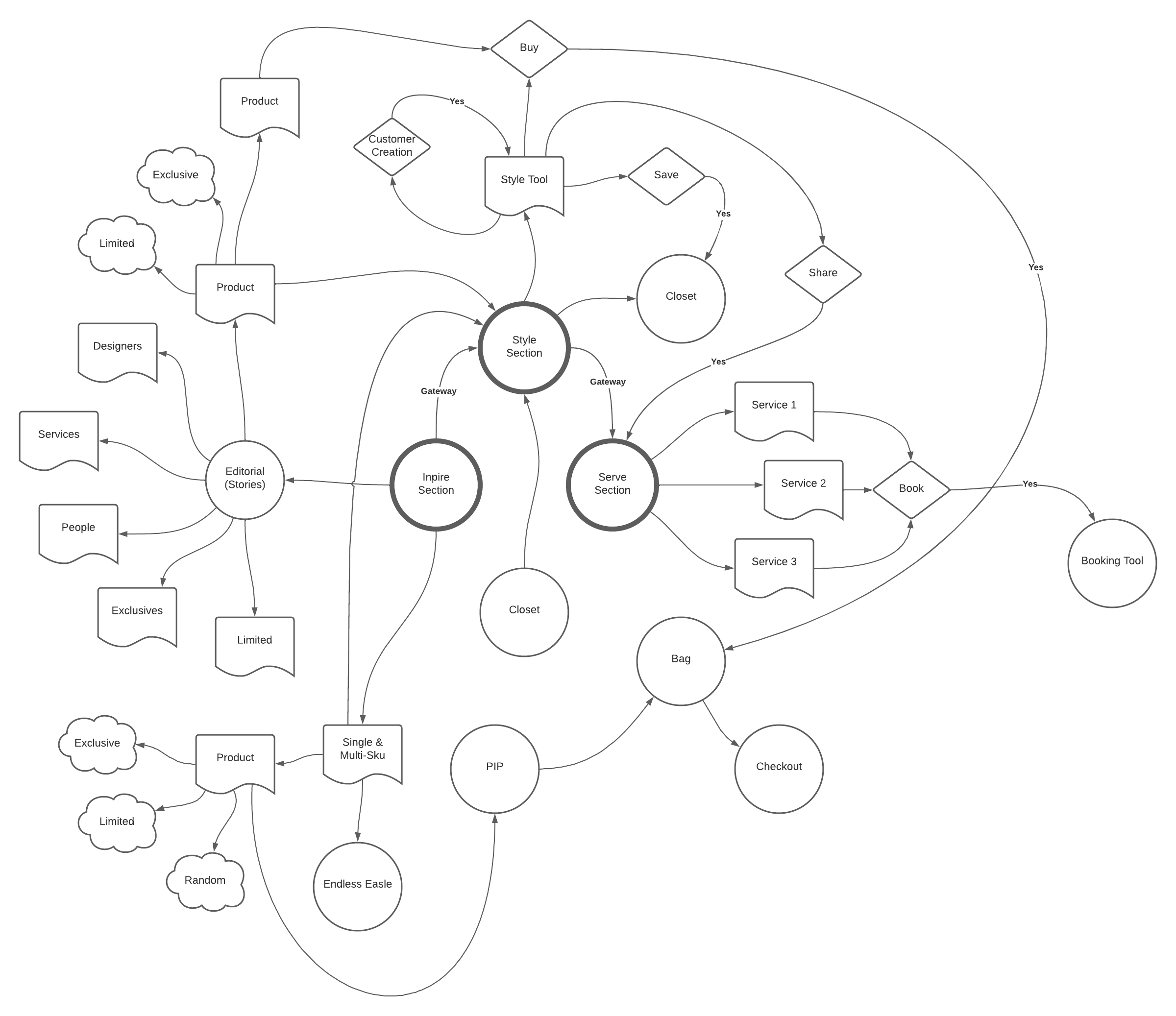
Once the flow chart was created, our next goal was to tackle all the different variables we had for content within the home screen.
We wanted to have auto-generated content based on user different user propensitoes such as brand, category and price point. We then identified three content types we needed to build out based on this with them being:
Next we needed to map out how the API would pull this data from our repository to build out each component.
We wanted to have auto-generated content based on user different user propensitoes such as brand, category and price point. We then identified three content types we needed to build out based on this with them being:
- Editorial card
-
Multi sku card
- Single sku card
Next we needed to map out how the API would pull this data from our repository to build out each component.


I was then tasked with designing the UI for the Inspire Feed, which was to be the home screen; the Style Tool for the style section; and the product description pages.
The Inspire Feed’s goal was to have 3 content types with a minimum of 4 cards and a maximum of 8 cards. The screen would adapt to user behavior and serve up cards based on interactions, so every user could have a unique screen based on their habits.
The Style Tool, which was rebranded as a Looks Card, was based on a product recommendation tool called Stylize that Neiman’s had recently acquired. It was a new way for us to recommend products to a user in a more interactive and holistic view.
The Product Description Page needed to be transformed to not only sell a product, but to also surprise and delight the user with related content for the item.
From here I spent the next two months iterating on these screens using a design system established by our team for the project. The first and largest task was to get the Inspire Feed created with this going through multiple rounds of cross-functional leadership reviews. The other two screens were easier to create because it was picking up design cues from the Inspire Feed, and didn’t need to go through the cross-functional leadership team.


Impact
Stanley by Neiman Marcus was launched in August 2021. It is an invite-only app that was sent to 10% of our customers from our targeted segments. It was not created to takeover the traditional Neiman Marcus shopping app, but to test out the content model and to create an in-house stack. With roughly about 10,000 users at its peak. Users in the app had an increased in-app session with Stanley averaging about 6 minutes over the Neiman Marcus app , and an AOV increase of about 18% over the Neiman Marcus app.
The content model was considered a success and with the API and content matrix in place we are now currently in the process of combining the two experiences into one app.
For confidentiality reasons I have omitted the actual values for these metrics.